
Comment Créer et Utiliser des Graphiques en Secteurs avec des Exemples
Dans ce guide, nous expliquerons ce qu'est un graphique en secteurs et quand il est logique d'en utiliser un. Nous vous aiderons également à créer votre propre graphique en secteurs instantanément avec ChartGo pour que vous puissiez visualiser comment chaque catégorie contribue au total. Les graphiques en secteurs sont idéaux pour montrer les proportions, les pourcentages et les comparaisons simples entre catégories. À quoi ressemblent vos données quand chaque tranche révèle sa part du tout ?

Qu'est-ce qu'un Graphique en Secteurs ?
Un graphique en secteurs est un graphique circulaire divisé en tranches, où chaque tranche représente la part d'une catégorie du total. C'est une façon simple et efficace de montrer les proportions, les pourcentages et comment les différentes parties contribuent à un tout.
En termes simples, un graphique en secteurs répond à une question : « Qui obtient quelle part du gâteau ? » Que vous montriez la part de marché, la répartition budgétaire, ou les résultats d'un sondage, les graphiques en secteurs facilitent la comparaison des catégories d'un coup d'œil.
Essayez Cet Exemple de Graphique en Secteurs dans ChartGo
Créer un Nouveau Graphique en Secteurs
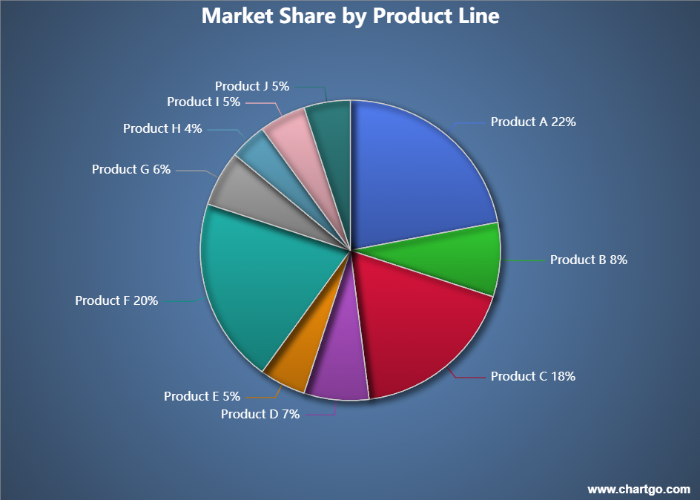
Ce graphique en secteurs illustre la répartition de la part de marché à travers dix lignes de produits différentes au sein d'une entreprise de biens de consommation. Chaque tranche représente le pourcentage du chiffre d'affaires total généré par cette catégorie. Comme le montre le graphique, les produits A, C et F représentent la majorité du chiffre d'affaires de l'entreprise, tandis que les lignes de produits plus petites contribuent des parts modestes mais stables. Les graphiques en secteurs sont idéaux pour révéler rapidement les catégories dominantes et identifier les domaines où des opportunités de croissance peuvent exister.
Quand Utiliser un Graphique en Secteurs
Les graphiques en secteurs sont les meilleurs quand vous voulez montrer comment chaque catégorie contribue au total. Ils facilitent la comparaison des proportions, des pourcentages et des tailles relatives d'un coup d'œil.
Par exemple, si vous visualisez la part de marché, l'allocation budgétaire ou les réponses à un sondage, un graphique en secteurs met en évidence quels segments dominent, lesquels sont plus petits et comment tout s'assemble. Il est parfait pour les comparaisons simples qui mettent l'accent sur les parties d'un tout.
Utilisez un graphique en secteurs quand vous voulez répondre à des questions comme :
- Quel pourcentage chaque catégorie représente-t-elle ?
- Quel segment est le plus grand ou le plus petit ?
- Comment deux tranches ou plus se comparent-elles en taille ?
- À quoi ressemble la répartition globale ?
Si votre objectif est de mettre en évidence les proportions ou la composition, un graphique en secteurs est le meilleur choix. Mais si vous avez besoin de comparer des valeurs précisément ou de montrer de nombreuses catégories, un graphique en barres peut communiquer l'information plus efficacement.
Créez et Personnalisez Votre Propre Graphique en Secteurs
Au lieu de simplement lire sur les graphiques en secteurs, ChartGo vous permet d'interagir directement avec un. Entrez vos catégories, mettez à jour les valeurs, et voyez les tranches redimensionner instantanément. C'est le moyen le plus rapide de comprendre comment les proportions changent lorsque vos données changent.
Vous pouvez également personnaliser le style visuel : transformer votre graphique en graphique en donut, afficher les pourcentages, ou activer les coins arrondis et les bords épais pour un look propre et moderne. Que vous vouliez un graphique classique ou un graphique stylisé pour une présentation, ChartGo vous donne un contrôle total avec seulement quelques clics.
Personnaliser l'Exemple de Graphique en Secteurs
Créer un Graphique en Secteurs
Ne lisez donc pas seulement sur les graphiques en secteurs, construisez et modifiez-les. Vous verrez rapidement comment chaque petit changement aide à raconter une histoire de données plus claire.
Exemples de Graphiques en Secteurs en Action
Les graphiques en secteurs sont parfaits pour montrer comment chaque catégorie contribue à un tout. Ils sont idéaux quand vous voulez comparer les proportions, mettre en évidence les segments dominants, ou raconter une histoire simple sur la répartition d'un coup d'œil. Voici trois exemples amusants qui démontrent comment les graphiques en secteurs donnent vie aux données quotidiennes.
1. Saveurs de Glace Préférées
Voyez quelles saveurs sont les plus populaires dans un petit sondage.
Un graphique en secteurs facilite la détection des saveurs dominantes et des favoris de niche.
2. Part de Temps de Visionnage des Services de Streaming
Comparez combien de temps les gens passent à regarder différents services de streaming dans un mois typique.
Les tranches révèlent quels services captent vraiment l'attention des spectateurs.
3. Popularité des Animaux de Compagnie dans le Quartier
Visualisez quels animaux les ménages possèdent le plus souvent.
Cet exemple montre comment un graphique en secteurs peut transformer de simples comptes de sondage en une image claire et mémorable.
Saveurs de Glace Préférées - Graphique en Secteurs
Par Josie
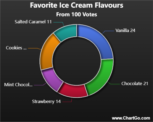
Ce graphique en secteurs montre quelles saveurs de glace sont les plus populaires dans un petit sondage de groupe.
Quelques saveurs classiques dominent le graphique, tandis que d'autres représentent des préférences plus petites mais fidèles.
C'est un exemple simple et amusant de comment les graphiques en secteurs révèlent les catégories dominantes d'un seul coup d'œil.
Temps de Visionnage des Services de Streaming - Graphique en Secteurs
Par Alana
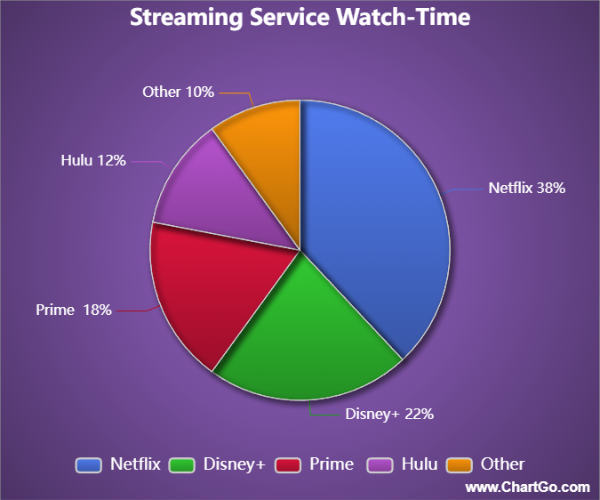
Ce graphique en secteurs compare le temps de visionnage mensuel à travers différents services de streaming.
Une plateforme mène clairement, tandis que les autres partagent des portions plus petites mais toujours significatives du temps de visionnage.
C'est un excellent exemple de comment les graphiques en secteurs peuvent rapidement communiquer où va vraiment l'attention.
Popularité des Animaux de Compagnie dans le Quartier - Graphique en Secteurs
Par Josie
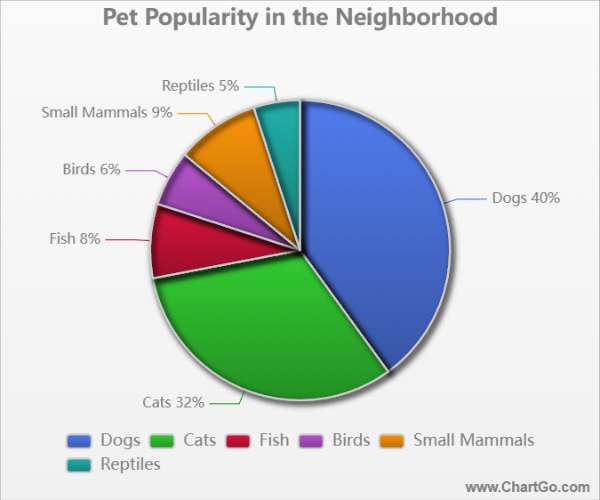
Ce graphique en secteurs montre à quel point différents types d'animaux de compagnie sont courants dans un sondage de quartier.
Les chiens et chats occupent la majeure partie du graphique, tandis que des tranches plus petites représentent les poissons, les oiseaux,
les petits mammifères et les reptiles. C'est une façon amicale et relatable de montrer comment les intérêts sont partagés.
Conseils d'Experts de l'Équipe ChartGo
Après des années à regarder les utilisateurs construire des graphiques en secteurs, nous avons appris ce qui rend un graphique en secteurs clair, impactant et facile à lire. Voici nos meilleurs conseils pour créer de grands visuels en secteurs :
- Utilisez un nombre limité de tranches : Les graphiques en secteurs fonctionnent le mieux avec 4–6 catégories. Trop de tranches rend le graphique encombré et réduit la lisibilité.
- Mettez en évidence les tranches clés : Utilisez le contraste de couleur ou la fonctionnalité « pourcentage » pour mettre l'accent sur les catégories qui comptent le plus. Votre message devient plus facile à comprendre d'un coup d'œil.
- Considérez un style donut : Les graphiques en donut améliorent souvent la lisibilité en plaçant l'accent sur l'anneau, pas sur le centre. Ils donnent aussi de l'espace pour les étiquettes ou les icônes si nécessaire.
- Ordonnez les tranches logiquement : Arrangez les tranches par valeur, de la plus grande à la plus petite, ou regroupez des catégories similaires ensemble. Cela aide les utilisateurs à interpréter le graphique plus rapidement.
- Utilisez les coins arrondis et les bords épais intentionnellement : Ces options de design donnent un look moderne mais doivent être utilisées avec parcimonie si la clarté est votre priorité absolue.
Rappelez-vous : Un graphique en secteurs concerne les parties d'un tout. Quand il est bien conçu, il révèle instantanément quels segments comptent et comment ils se rapportent. ChartGo facilite l'ajustement fin des couleurs, des styles et des étiquettes pour que votre graphique en secteurs communique clairement et magnifiquement.