
How to Create and Use Area Charts with Examples
In this guide, we’ll explain what an area chart is and when to use it. But more importantly, we’ll show you how to create your own area chart instantly with ChartGo, so you can learn by doing not just reading. Area charts combine the clarity of line charts with the impact of colour and fill, helping you visualize both trends and totals over time. What does the shaded area of your chart say about your results?

What is an Area Chart?
An area chart is a type of graph that looks like a line chart but the space under the line is filled with colour. This makes it easier to see not only how numbers change over time, but also how big they are when compared to each other. In simple terms, it’s like a line chart with a “highlighter” underneath, showing you trends and totals more clearly.
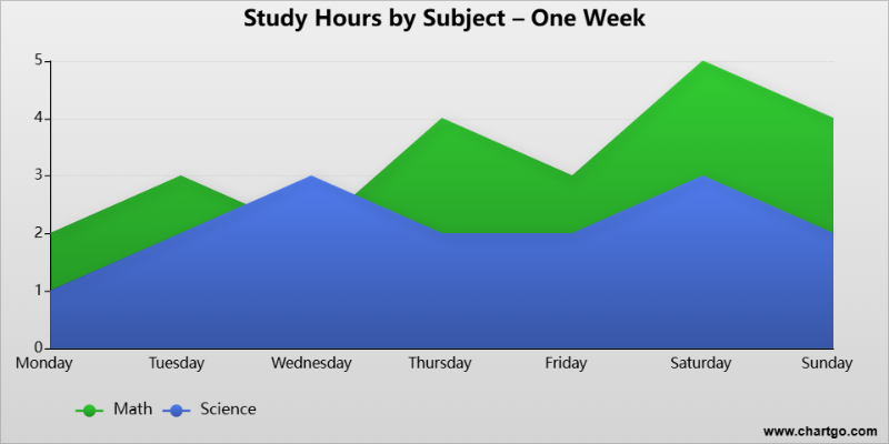
For example, if you wanted to track how many hours you study each day, a line chart would show the ups and downs. An area chart, on the other hand, fills in the space below the line so you can instantly see the total effort building up across the week.
Try This Area Chart Example in ChartGo
Create a New Area Chart
Because the shaded area stands out, area charts are especially good for showing trends, totals, and comparisons over time. With ChartGo, you can take this example, customize it with your own data, and instantly see how the results change.
When to Use an Area Chart
Area charts are best when you want to show changes over time and also highlight the total amount. They make trends easier to spot because the shaded area really pops out on the page.
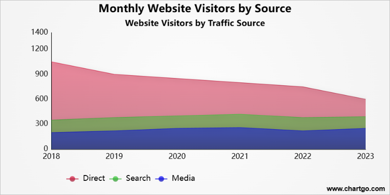
For example, if you track how many people visit your website each week, a line chart shows the ups and downs, but an area chart makes the rise or fall feel much more obvious because of the filled-in space. It’s like watching a bucket fill up or empty out.
Use an area chart when you want to answer questions like:
- Show overall growth or decline over time.
- Highlight the total amount, not just the trend line.
- Compare how different groups or categories stack up.
- Make data feel more “solid” than a simple line chart.
If all you need is to show a simple up-and-down line, a line chart might be enough. But if you want to make the volume or total really clear, an area chart is the better choice.
Create and Customize Your Own Area Chart
Most guides only explain what an area chart is. With ChartGo, you actually get to test it yourself. Change the numbers, swap the labels, add more categories and watch your chart update instantly.
This is the best way to really understand how area charts work. Instead of staring at static images, you can see how the chart responds the moment you tweak something. It’s hands-on learning at its fastest. You’re not stuck with the default look. You can customize colours, area layout and area style to match your project or presentation. Want bright colours for a classroom demo? Or something more professional for work? It’s all just a click away.
Customize Area Chart Example
Create a New Area Chart
So don’t just read about charts, play with them. The more you experiment, the more the patterns in your data will make sense.
Examples of Area Charts in Action
Sometimes the fastest way to learn is to see real examples. Here are a few ways area charts can be used to make numbers more clear and engaging.
1. Water Intake Over a Week
Track how many glasses of water you drink each day. The area shows your total hydration building up over the week.
2. Monthly Coffee Sales by Type
Compare hot and iced coffee sales side by side. The stacked areas highlight seasonal shifts — hot coffee in winter, iced coffee in summer.
3. Weekly Steps Count
Watch your activity rise and fall over the week. The shaded area makes it easy to see high-energy weekends vs. slower weekdays.
Water Intake Over a Week – Area Chart
By Josie
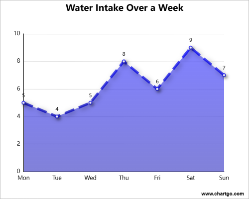
Track your hydration habits with this easy area chart.
See daily water intake build up across the week and spot
patterns at a glance. Great for simple, one-series data.
Monthly Coffee Sales by Type – Area Chart
By Ariana
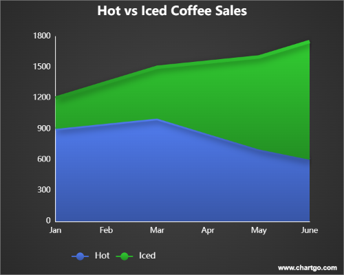
Compare hot vs. iced coffee sales across seasons. The stacked areas highlight how preferences shift, hot coffee in colder months, iced coffee in summer. Perfect for showing totals and category comparisons.
Weekly Steps Count - Area Chart
By Josie
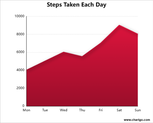
See your daily activity levels add up over the week.
The shaded area makes it clear when you’re most active
and when your steps fall behind. A simple way to track trends.
Expert Tips from the ChartGo Team
Over the years, we’ve seen thousands of people use ChartGo to bring their data to life. Here are a few quick tips from our team to help you get the most out of your area charts:
- Keep it simple: Don’t overload your chart with too many categories. Two or three is usually enough for the data to stay clear.
- Use colour wisely: Pick strong, distinct colours so each area stands out. Avoid too many shades of the same colour, which can get confusing.
- Label clearly: Always include titles and axis labels. A chart should be understandable even without extra explanation.
- Tell a story: Think about the message you want your chart to show. A simple adjustment in style or order can make trends jump out more clearly.
Remember: Area Charts aren’t just about numbers, they’re about communicating information. The best area charts are the ones that make your audience say, “Oh, I get it now.” With ChartGo, you can practice until your story is crystal clear.