
Understanding Barbell Charts with Examples
A Barbell Chart, also known as a Dumbbell Chart, is used to compare two numeric values across different categories. Each line connects two circles representing values such as Start and End, making it easy to visualize changes or gaps between them. At ChartGo, we use the terms barbell and dumbbell interchangeably.

What is a Barbell Chart?
A barbell chart visually connects two points of data across categories to show differences or changes over time. It’s especially effective when you want to highlight progress or variation between two values. Basically, a before vs after or a start vs end.
With ChartGo, you can now easily generate barbell charts online! The barbell chart example shows how the format can be applied to business or financial data.
The chart above compares profit generated by department, connecting two values to show the change between the start and end of a period. The visual connection between points helps users easily interpret growth or decline.
When to Use a Barbell Chart
Barbell charts are ideal when you need to emphasize differences between two related data points. Unlike traditional bar or line charts, barbells focus on the distance between two numbers, making it easy to see change at a glance.
Use a barbell chart when you want to answer questions like:
- How much did performance improve from start to end of the year?
- Which departments saw the largest change in revenue?
- Where are the biggest gaps between two metrics (e.g., targets vs results)?
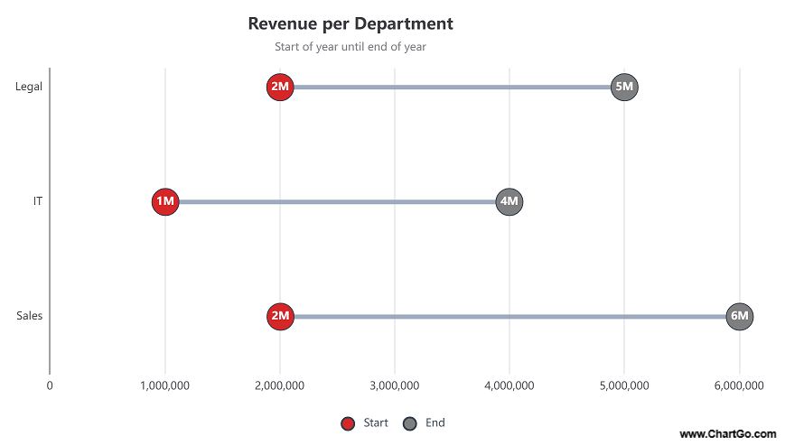
The example above compares start vs end of year revenue for several departments. The connecting line clearly indicates how much each department’s revenue increased or decreased. It’s an excellent way to visualize size of change while keeping the design simple.
Examples of Barbell Charts in Action
Sometimes the fastest way to understand a chart is to see it in action. Below are a few ways barbell charts can clearly show progress, comparisons, and changes between two points.
1. Profit Comparison by Department
Each line connects two values, start and end profit, helping you spot which departments improved the most or fell behind.
2. Expense Rage Across Teams
See how team expenses have evolved over time. The gap between points highlights areas of growth or reduction.
3. Revenue Over Time
Track how total revenue changed from the beginning to the end of the year. The connecting bars make upward or downward movement easy to interpret.
Profit Comparison by Department
Start vs End
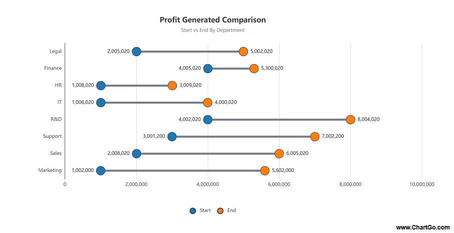
This barbell chart compares departmental profits from two periods. The horizontal lines emphasize the gap between start and end values, allowing quick insights into improvement or decline.
Expense Range Across Teams
Start vs End of Year
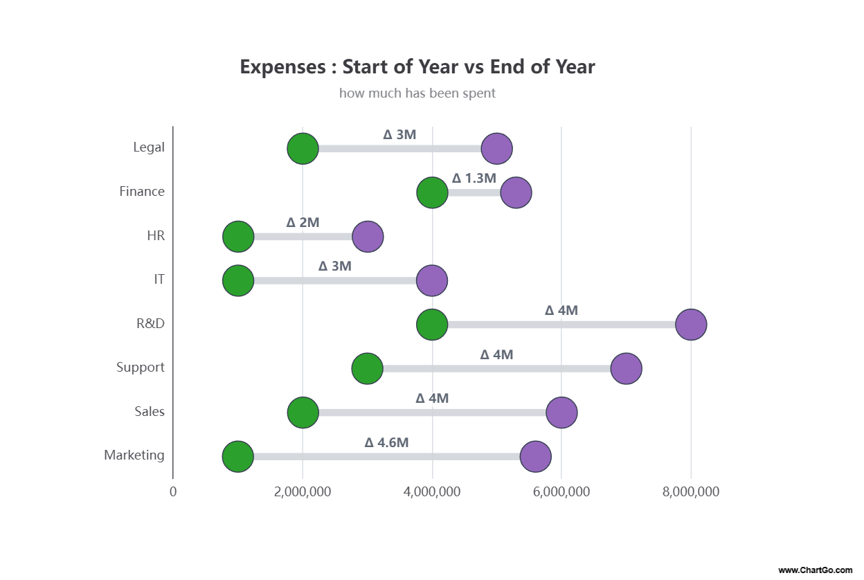
This chart highlights expense range growth across selected teams. It’s a perfect example of how barbell charts can visualize improvement using colour coded markers and clean spacing.
Revenue Over Time
Start vs End of Year
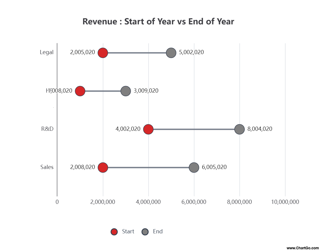
This example shows yearly revenue for multiple departments. The connecting bars make it easy to compare revenue patterns and identify which areas had the largest variation.
Expert Tips from the ChartGo Team
Based on years of user feedback and chart design insight, here are a few recommendations for creating clear and effective barbell charts:
- Focus on clarity: Keep your chart simple. Too many categories can clutter the visual connection.
- Use color contrast: Distinct start and end colors make it easy to track which side represents which value.
- Label endpoints: Add clear numeric labels at both ends of each barbell for quick reference.
- Highlight differences: Use subtle annotations or text (like “Δ +3M”) to show the change between points.
- Stay consistent: Align your scales and spacing evenly so the viewer focuses on the data, not layout discrepancies.
Remember: Barbell charts aren’t just about comparing numbers, they’re about communicating the degree of change. When done right, they turn simple numeric differences into powerful visual stories.