
How to Create and Use Bar Charts with Examples
In this guide, we’ll explain what a bar chart is and when to use it.
But more importantly, we’ll show you how to create your own bar chart
instantly with ChartGo,
so you can learn by doing not just reading. Bar charts are all about clear
comparisons. Each bar should tell a story.
What do you want viewers to notice right away when they look at your chart?

What is a Bar Chart?
A bar chart is one of the simplest and most effective ways to compare values across different categories. Each bar represents a number or amount, and the length or height of the bar shows how big that number is. The taller or longer the bar, the larger the value.
For example, if you wanted to compare how many students enjoy each subject, a bar chart would show one bar per subject, making it easy to see which topics are the most popular.
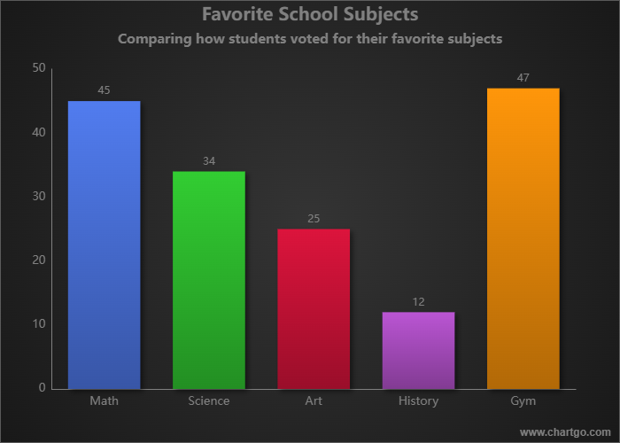
In the example, it’s obvious right away which subject students prefer most. That’s the beauty of a bar chart, it communicates the message before you even start reading the numbers.
When to Use a Bar Chart
Use a bar chart when you want to compare things side by side, such as results, categories or performance. They’re ideal when the goal is to see which category is bigger or smaller at a glance.
For example, if you want to show which social media platform brings the most visitors to your website, a bar chart makes that comparison effortless. You’ll instantly see which bars dominate and which ones lag behind.
Bar charts answer questions like:
- Which item performs best or worst?
- How do categories compare?
- How much bigger or smaller is one thing than another?
- What trend or pattern do you notice in the data?
A few quick guidelines:
- Use horizontal bars: when category names are long or numerous.
- Use vertical bars: when showing changes over time.
- Limit clutter: too many bars make comparisons harder.
- Sort bars: from highest to lowest to make patterns stand out.
Create and Customize Your Own Bar Chart
Reading about bar charts is one thing, creating one is better. With ChartGo, you can experiment instantly. Add or remove bars, rename categories, adjust colours or change the orientation and see the chart respond in real time.
This hands-on approach helps you understand not just what a bar chart is, but how it tells your data’s story. Want to emphasize growth? Sort bars by value. Want to highlight comparisons? Use colour contrast or add labels directly on the bars.
And since every presentation or project is different, you can personalize everything: from colour palettes to spacing, borders and backgrounds. Make your bar chart as playful or professional as you need.
Customize Bar Chart Example
Create a New Bar Chart
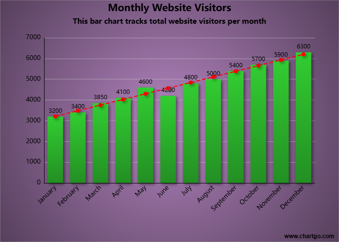
This chart is designed to show the overall trend, not just individual values. The bars display monthly data, but the trendline makes the steady growth throughout the year instantly clear.
Examples of Bar Charts in Action
Sometimes the best way to learn is by seeing how bar charts work in real life. Here are a few examples you can try with ChartGo:
Highlight Key Insights
Show viewers what matters most at a glance.
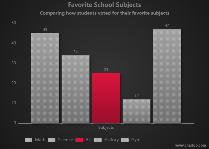
Notice how one red bar changes the focus completely. By using colour contrast, you can guide the viewer’s eye to what matters most in your data.
Favorite Streaming Platforms - Bar Chart
Show viewer preferences and highlight a standout platform.
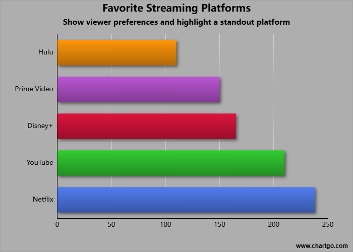
See which streaming platforms dominate the market. Data direction can draw attention to the top performer helping viewers instantly recognize what stands out. Use this chart style to compare audience preferences and emphasize key insights in your data.
Monthly Sales by Product Category
Show sales trends and comparisons across product types.
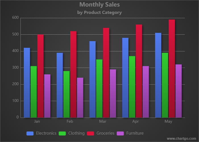
This dataset works great for a grouped bar chart showing how sales in each category evolve over time. You can emphasize growth in a specific category using colour.
Expert Tips from the ChartGo Team
After helping thousands of users visualize their data, our team has learned what makes bar charts really shine. Here are a few quick tips:
- Be consistent: Keep your scale even and spacing uniform. It helps viewers trust what they see.
- Use colour strategically: Highlight one bar to draw attention. Too many colours can distract.
- Label clearly: Each axis and bar should be easy to understand without extra context.
- Avoid distortion: Always start your axis at zero. Cutting it can make differences look exaggerated.
- Tell your story: Think about what you want people to notice first. Sort or colour your bars to guide their eyes.
Remember: a bar chart’s power is in its simplicity. The best ones make you think, “That’s obvious now!” With ChartGo you can explore, adjust and share your own bar charts until your data speaks clearly for itself.