
Understanding the Different Types of Charts
In this guide, we’ll walk through the main types of charts and explore what each one is best for, when to use it, and how to communicate your data more clearly. Each chart type tells a slightly different story about your data. Some highlight comparisons, while others reveal patterns or relationships. Learning how to match your data with the right visual makes your message easier to understand and far more powerful. Whether you’re comparing categories, spotting trends, or exploring relationships, this page will help you choose the chart that best fits your message.

Two Families of Charts
Every chart fits into one of two families, Category or XY. The one to choose depends on the kind of data you want to display. Each family organizes information in a different way, helping you highlight the right message in your data.
- Category Charts: If your data uses names or labels like months, departments or product types, you’re working with categories. These charts are all about comparing groups side by side to see which one stands out or changes the most.
- XY Charts: If your data is based on numbers on both axes like time, distances or temperature, then it belongs in the XY family. Each point on the chart represents a pair of numeric values, one for the X-axis and one for the Y-axis. These charts are all about showing trends, correlations, or comparisons between variables to see which one stands out or changes the most. They help you spot patterns or relationships, such as how one value increases while another decreases.
Once you know which family your data belongs to, it becomes much easier to choose the chart type that fits your story.
Examples of Category Charts in Action
Category charts are great when your data is grouped into names or labels, such as months, products, or departments. They help you compare how each category performs side by side, making differences easy to see at a glance.
- If your X-axis shows names or labels instead of numbers, you’re working with a category chart.
- These charts are perfect for comparing totals, ranking items, or showing how different groups stack up.
- Common types include Bar, Pie, Area, and Line (Category).
Bar Chart - Category
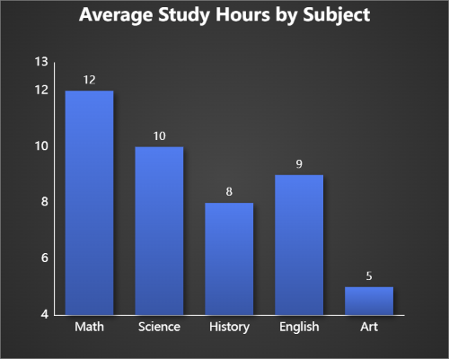
Bar charts are perfect for comparing values across categories like sales by department, popular school subjects or product popularity. Each bar shows how one group measures up against the others.
Pie Chart - Category

Pie charts show how each category contributes to a total. They’re great for visualizing proportions or percentages in your data.
Area Chart - Category
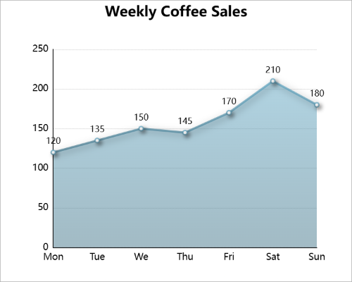
Area charts are great for showing gradual change across labeled days. This example tracks cups of coffee sold throughout the week, with the shaded area showing busier weekends and slower weekdays.
Examples of XY Charts in Action
XY charts use numeric values on both axes, helping you explore relationships and patterns in continuous data. They’re perfect for showing trends, correlations, or comparisons between numeric variables.
- If both your X-axis and Y-axis display numeric values, you’re working with an XY chart.
- These charts are ideal for visualizing relationships, continuous change, or data clusters over time.
- Common types include Scatter, Bubble, Line, Histogram and Barbell (Dumbbell) charts.
Scatter Graph (XY)
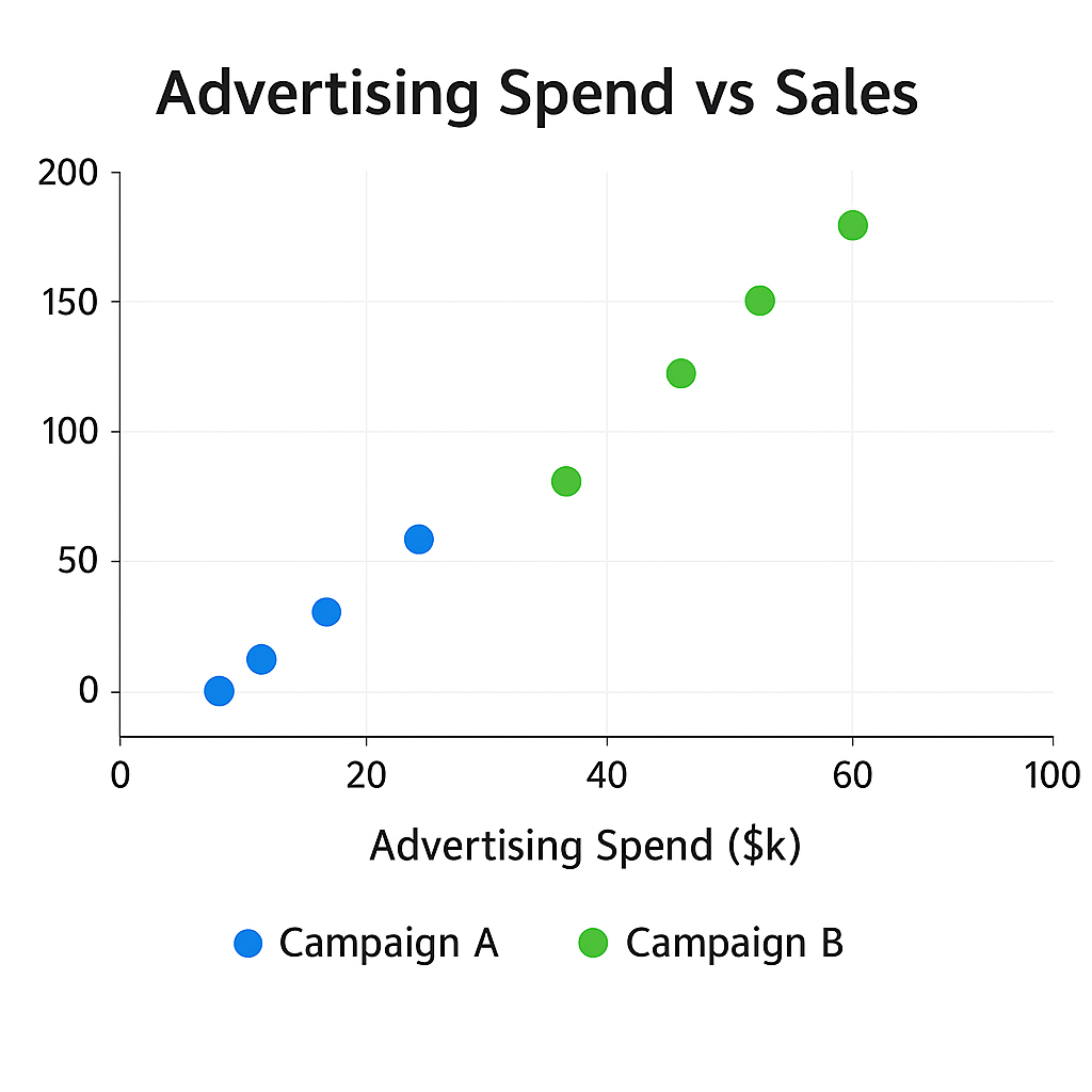
Scatter graphs display pairs of numeric values to show how two variables relate. They’re great for identifying correlations or spotting patterns, such as how one metric increases as another rises.
Bubble Graph (XY)
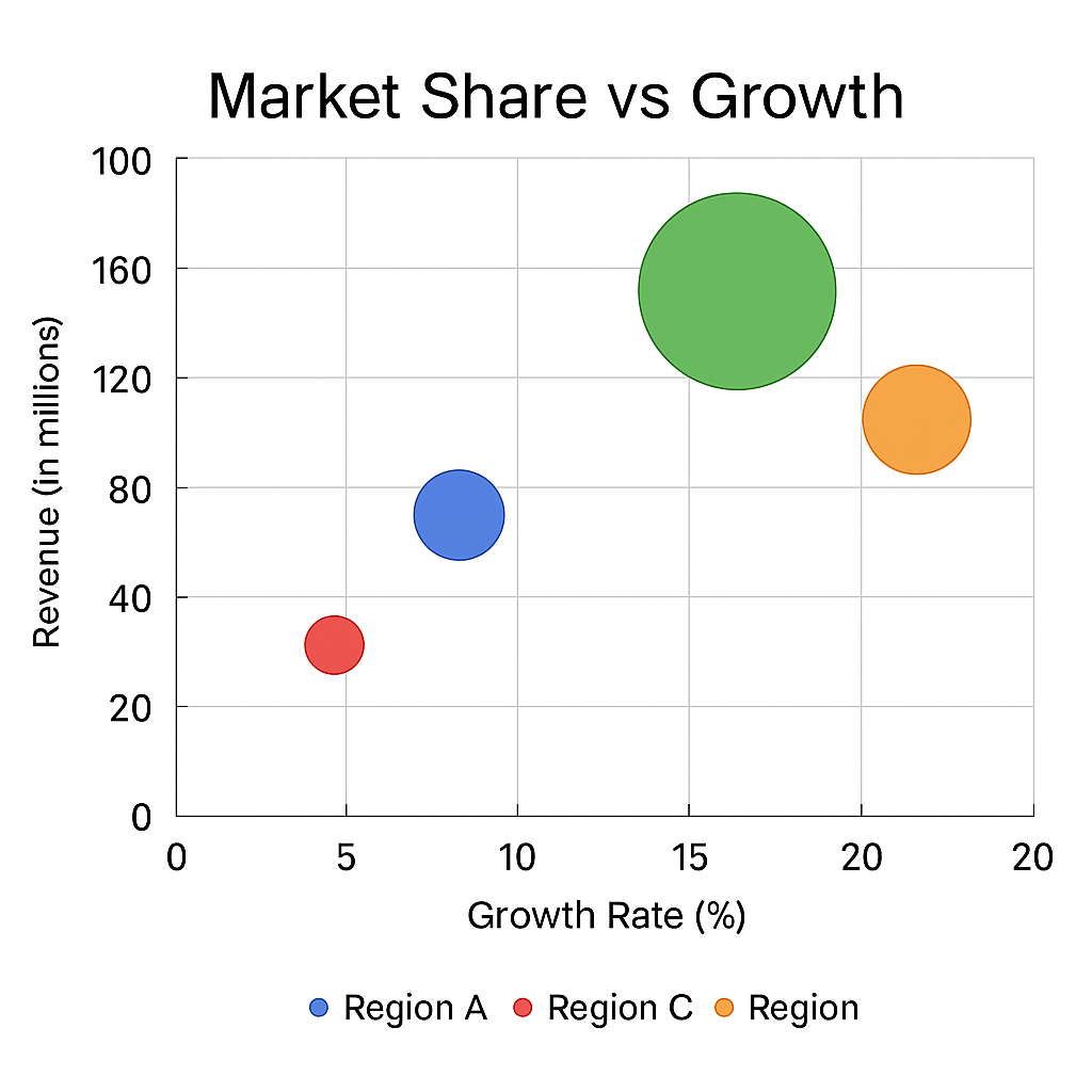
Bubble graphs extend scatter graphs by adding a third dimension with bubble size. They’re perfect for comparing multiple variables visually, showing scale or magnitude differences at a glance.
Choosing the Right Chart
Picking the right chart depends on what story your data needs to tell. Use a bar or column chart for quick category comparisons, a line chart for trends, or a pie chart to show proportions. When you’re analyzing relationships between numbers, XY charts like scatter or bubble are your best friends.
| Goal | Recommended Chart Type | Chart |
|---|---|---|
| Compare categories | Bar or Column | |
| Show composition | Pie or Donut | |
| Show change over time | Line or Area, or Combo | |
| Highlight change between two values | Barbell (Dumbbell) | |
| Show relationships | Scatter or Bubble | |
| Show distribution | Histogram |
Think about your goals : comparison, change, composition, or relationship. Once you know what you’re trying to show, the right chart usually chooses itself.
Try It Yourself on ChartGo
The best way to learn charts is by creating them. Jump into ChartGo and experiment. Change labels, switch chart types or upload your own data. Seeing how your data looks in different formats helps you understand which chart tells your story best.
Whether you’re building a pie chart for a school project or an XY graph for a report, ChartGo makes it easy to turn data into visuals you can share instantly.